
The Waterfall chart is a topological graph for performing manual analysis by comparing multiple spectrums. This article describes the tools and functions of the chart.
- Amplitude & Frequency
- Keyboard shortcuts
- Cursor tools
- Zoom
- Logarithmic scale
- Fixed scale
- Performance mode
- Export
Amplitude & Frequency
The vertical Y Axis can represents vibration or acceleration amplitude. The horizontal X Axis represents the frequency (Hz, CPM or Orders of running speed) of the measurement. You can switch between Hz and CPM in the global toolbar (see red marking) or toggle on Orders in the Waterfall chart (see orange marking). Your choice will persist between sessions.

Keyboard shortcuts
You can use keyboard shortcuts navigate between functions in the chart to place and move a single cursor, switch between logarithmic/linear or fixed/auto scale for example. You will find more information about each shortcut here: Which keyboard shortcuts are available in Analyze?
Cursor tools
Single cursors are available to analyse the spectrums in the Waterfall chart. More information about these cursor can be found in this article: Which different plot cursors are there and how do I use them?
Zoom
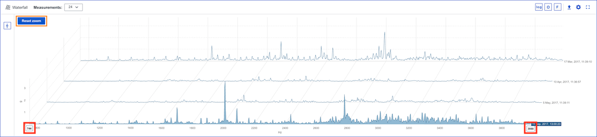
It is possible to zoom in/out in the chart to view the data . Compared with the other charts, zoom is done differently in the Waterfall chart due to restrictions in the software used for rendering the charts. To zoom in you have two handles on the x-axis (see red markings), drag them to the frequency span you want to analyse. To zoom out you can drag the handles in the opposite direction. If you drag them to the end of the x-axis you will reset the current zoom state, you can also reset the zoom state by using the same button as in the other charts (see orange marking).
Logarithmic scale
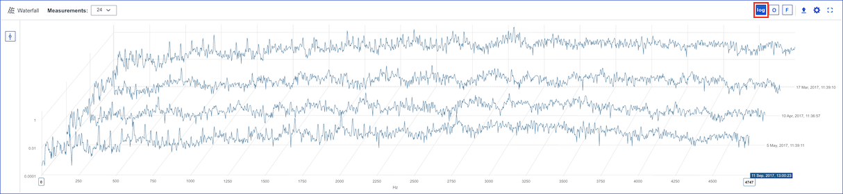
The option to switch between linear and logarithmic scale exists for the Waterfall chart (see toggle option marked in red). The chart below shows the use of a logarithmic y-axis. Logarithmic axis can be useful when dealing with data with spikes or large value gaps, as they allow variance in the smaller values to remain visible.
Fixed scale
Fixed scale can be used if you are interested in analysing data and you don't want the values on y-axis to adjust automatically, you want the y-axis to be fixed.
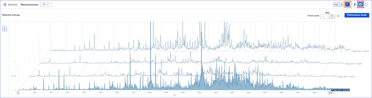
To adjust fixed scale settings for acceleration, vibration or velocity select a correlated point and enter Waterfall settings (see red marking in example below for an acceleration measurement point) and enter the preferred max values. To switch between fixed and auto scale press the F button (see orange marking).
Performance mode
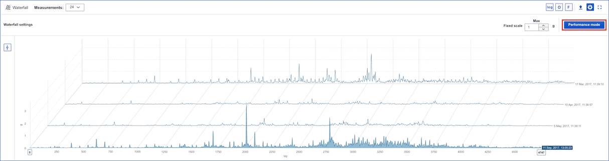
When you are analysing data in the Waterfall chart it can be very time consuming to await the data to be rendered if you, for example have 24 spectrum with a long frequency range. Therefore we have developed Performance mode. Performance mode hides some x-axis values for every spectrum while preserving the highest amplitudes to improve performance. Performance mode is activated by pressing the 'Performance mode' button (see red marking).
Export
It is possible to export the current state of the chart to an image to add in reports . More information is accessible in this article: Export chart to image.
Comments
0 comments
Please sign in to leave a comment.