
Heatmap chart is a topological graph for performing manual analysis on multiple measurements where the value of the spectrums amplitude is displayed on a heatmap. This article describes the tools and functions of the chart.
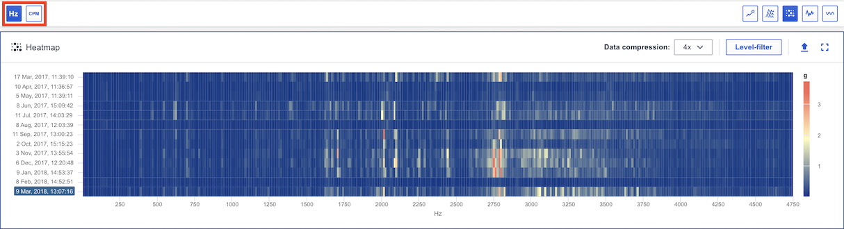
Amplitude & Frequency
The vertical Y Axis represents the date of each spectrum represented. The horizontal X Axis represents the frequency (Hz or CPM) of the measurement. You can switch between Hz and CPM in the global toolbar (see red marking). Your choice will persist between sessions.
Keyboard shortcuts
You can use keyboard shortcuts navigate between functions in the chart. You will find more information about each shortcut here: Which keyboard shortcuts are available in Analyze?
Zoom
It is possible to zoom in/out in the chart to view the data . More information is accessible in this article: How to zoom in the analyze charts?
Export
It is possible to export the current state of the chart to an image to add in reports . More information is accessible in this article: Export chart to image.
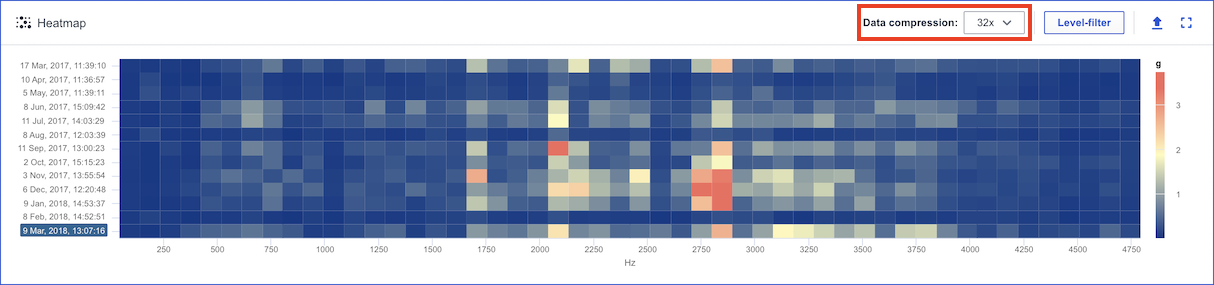
Data compression
The data compression function (see red marking) improves performance by hiding some x-axis values while preserving the highest amplitudes. You can compress the data 2x, 4x, 8x, 16x, 32x. Based on the available number of data points to render a default compression will be set automatically. The data compression functionality can be turned off in the drop down as well.
Level filter
The function level filter (see red marking) highlights peaks by grouping values at lower amplitudes to the same color.

Comments
0 comments
Please sign in to leave a comment.