
Spectrum chart is a tool for performing analysis by breaking down the vibration measurements into component frequencies. This article describes the tools and functions of the chart.
- Amplitude & Frequency
- Keyboard shortcuts
- Cursor tools
- Zoom
- Option to compare measurements
- Logarithmic scale
- Fixed scale
- Speed
- Export
Amplitude & Frequency
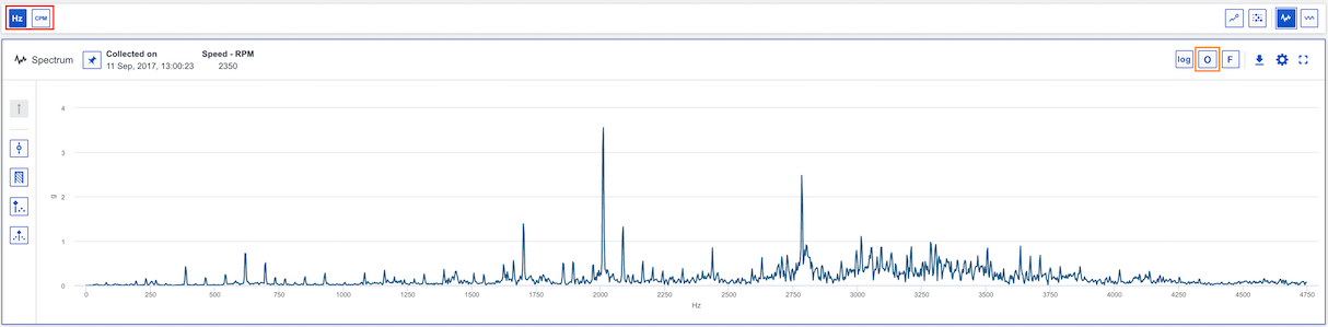
The vertical Y Axis can represents vibration or acceleration amplitude. The horizontal X Axis represents the frequency (Hz, CPM or Orders of running speed) of the measurement. You can switch between Hz and CPM in the global toolbar (see red marking) or toggle on Orders in the spectrum chart (see orange marking). Your choice will persist between sessions.
Keyboard shortcuts
You can use keyboard shortcuts navigate between functions in the chart to place cursors, move and adjust them, switch between logarithmic/linear or fixed/auto scale for example. You will find more information about each shortcut here: Which keyboard shortcuts are available in Analyze?
Cursor tools
Single, band, harmonics or sidebands cursors are available to analyse a Spectrum. We also provide the option to add cursors on known fault frequencies. More information about these cursor can be found in this article: Which different plot cursors are there and how do I use them?
Zoom
It is possible to zoom in/out in the chart to view the data . More information is accessible in this article: How to zoom in the analyze charts?
Option to compare measurements
You can select two measurements to compare spectrums, within an asset or between assets. Press pin for comparison (see red marking) and select another measurement from the trend if you want to compare measurement for the same point. As you can see in the trend two points are selected (see orange marking). If you want to compare between assets, just press pin for comparison and change asset to analyze.

Logarithmic scale
The option to switch between linear and logarithmic scale exists for the Spectrum chart (see toggle option marked in red). The chart below shows the use of a logarithmic y-axis. Logarithmic axis can be useful when dealing with data with spikes or large value gaps, as they allow variance in the smaller values to remain visible.

Fixed scale
Fixed scale can be used if you are interested in analysing a certain y-axis range and don't want the axis to adjust automatically.
To adjust fixed scale settings for acceleration, vibration or velocity select a correlated point and enter Spectrum settings (see red marking in example below for an acceleration measurement point) and enter min and max values. To switch between fixed and auto scale press the F button (see orange marking).

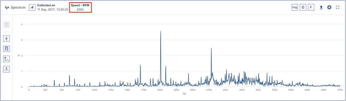
Speed
The speed of the measurement is shown in the upper toolbar of the Spectrum chart (see red marking). Single cursors will be placed on 1x running speed. Notice that you can change the speed in the chart but it will not be saved.
Export
It is possible to export the current state of the chart to an image to add in reports . More information is accessible in this article: Export chart to image.
Comments
0 comments
Article is closed for comments.